We know how to push the right buttons on our shiny doodads but, asks ANNA BUTTERFIELD, do we know what’s going on under the dazzling exterior?
In family lounges worldwide, the contradictions of technology are playing out. We marvel at tech-savvy youth, their fingers dancing across screens with practiced ease. We expect them to learn, understand, and build anything with these amazing tools, and in turn, teach us how to use all the devices. But curmudgeonly, we must admit – they really just know how to press buttons. The fundamental truth is that we’ve simplified technology to such an extent that even a toddler can use it.
The maestro of simplification
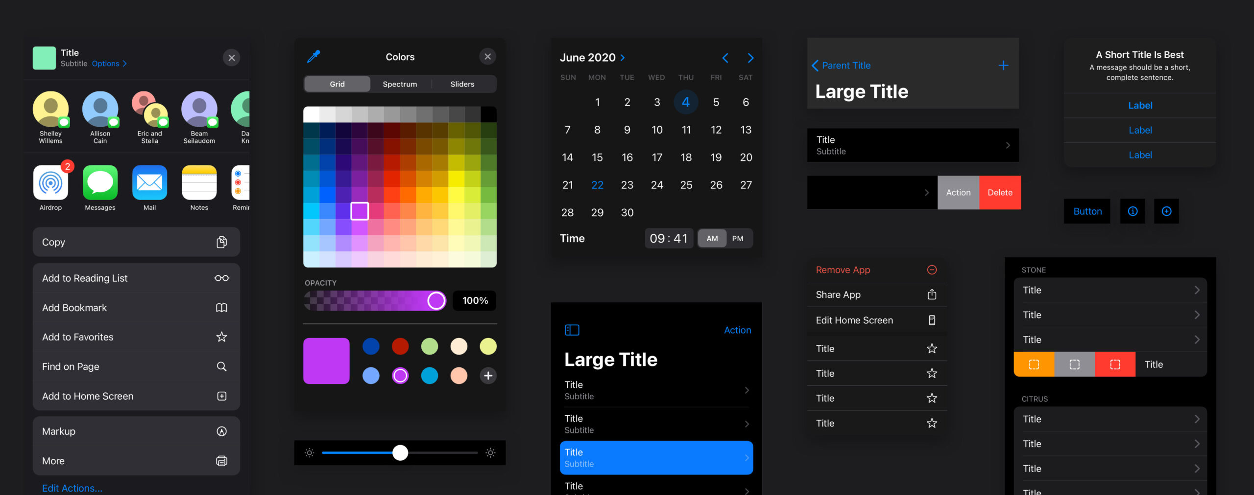
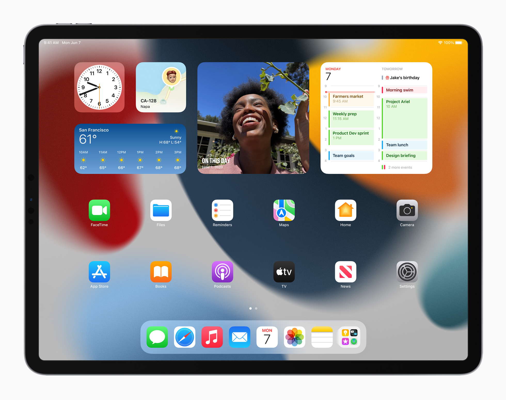
Apple has crafted an empire on the premise of user-friendly interfaces. From iPhones to iPads, their devices serve as models of intuitive design excellence. Touch gestures, clear icons, and consistent layouts form a universal language, spoken fluently by octogenarians and adolescents alike.
The iPad, Apple’s digital Swiss Army knife, is a testament to the allure of simplicity. With over 400 million units sold, it’s a portal to a digital life unburdened by the complexities of traditional computing. Artists sketch masterpieces on the go, and students take notes with the flick of an Apple Pencil.
Apple has fostered a loyal customer base and set industry standards. They’ve turned utilitarian design into a must-have fashion accessory, sugar-coating its high price tag in textured matte glass wrapped in an anodized aluminum band. Our tools have been meticulously crafted to be accessible and straightforward.

The cost of convenience
Look, democratization of technology is fantastic! It means anyone at any age can perform complex tasks with minimal effort. Even my 80-year-old Dad can video chat with his grandkids spread asunder, have Zoom checkups with specialists in other cities, and buy goods from farmers in the Himalayas should he really want. It’s a world where technology does our bidding. Mostly…
But it comes at a cost: the depth of engagement with technology itself.
As our devices become more complex, our interaction with them becomes increasingly superficial. We swipe, tap, and pinch our way through curated digital landscapes, never questioning the underlying mechanisms that make it all possible. Search means you don’t even have to name files anymore. In our rush to make everything “user-friendly,” we’ve traded understanding for convenience, and knowledge for ease of use.
This is the delusion of simplicity: the belief that by making technology easier to use, we’ve made ourselves more technologically adept. In reality, we’ve just become more dependent on interfaces designed to shield us from complexity.

The black box of technology
As any web developer, IT professional, or customer service representative will testify – clients don’t care about the inner workings; they just want technology to function as they expect. We are becoming intolerant of complexity. The black (or in Apple’s case, white) box of technology remains sealed, its inner workings a mystery to those who use it most.
Any understanding of ‘what lies beneath’ – the myriad of technologies, structures, systems, protocols, concepts, processes, methodologies, or philosophies which make up this momentous, insanely complex, frustratingly fragile, and beautiful thing we call the internet – is lost.
The evolution of our relationship with technology
Our sleek and powerful devices have become extensions of ourselves. They perform tasks, sometimes not exactly as we’d like, but enough to get by. They eat up our time, display content at the bidding of advertisers, distract us with notifications, and keep us contactable 24/7. They piss us off when they don’t work. But we seldom leave home without them. So are they working with us, for us or against us?


A call for curiosity
This isn’t a call to dismantle user-friendly interfaces or to revert to command-line computing. But we should be a lot more curious about their inner workings and how we outwardly incorporate them in our lives. As we march forward into a future of ever-more integrated technology, our relationship with these tools has got to evolve.
Perhaps the next frontier in tech design isn’t more simplification, but a thoughtful unveiling of complexity? Imagine interfaces that not only serve our needs but also educate, that spark curiosity and reward exploration. Where ‘content’ isn’t dumbed down to 5th grade reading levels to generate the most ad revenue, but actually inspires reflection and creation.
The true power of technology lies not in its ability to simplify our lives, but in its potential to expand our understanding of the world.


